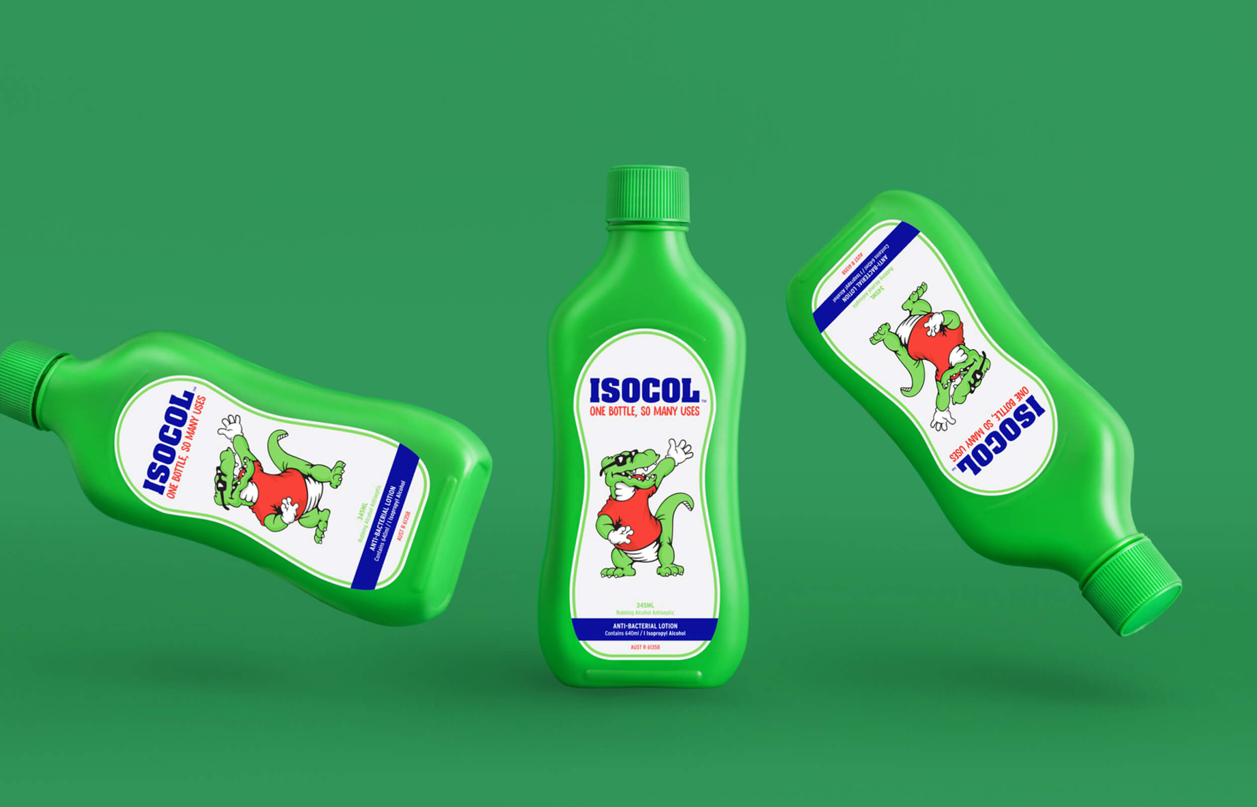
Isocol
One Bottle, So Many Uses
When over 35 years of brand heritage and one of Australia’s most iconic antiseptic lotions come knocking at the door to redefine their future, you answer by leaning on the past.
As a household name and the supermarket leader in antiseptic lotions in Australia, Isocol approached Firme to reboot its visual brand identity and packaging to help the brand stand out in a crowded marketplace.
With its distinctive green packaging and iconic Isocroc brandmark, the challenge was to create a new graphical look for the brand, one that is sensitive to its current and beloved status in Australian homes but radical enough to appeal to new everyday consumers and those who had shied away from the product.
The new visual identity brought newfound strength, bold simplicity, and rigour to the brand, extending its look into the future while ensuring we remembered the past.